

Chase Mobile App: Self-Directed Investing
When I joined Chase as a senior content designer for Self-Directed Investing, users couldn’t reliably do the basics: transferring money, executing trades, or even finding the stocks they already owned. The investment dashboard wasn’t meeting their needs and the support data showed it.
Over roughly two and a half years, I led content design for a phased rebuild of the dashboard’s navigation, partnering with research, design, product, legal, and compliance to test labels, restructure the information hierarchy, and rewrite microcopy across the experience.
The result: a 200% increase in engagement across the experience and 60% call volume reduction to the service center for key jobs to be done.
After a multi-year effort, we were finally able to create meaningful changes for users, helping them easily complete the things that matter to them.
The dashboard navigation rebuild
Navigation
Navigation was the biggest issue for users. To solve it, we took a closer look at how users actually completed their key tasks in the app.
I partnered with research and analytics to triangulate the problem. Heatmaps and tap data showed where users got stuck. Competitive analysis showed what the category had standardized on. Live client interviews gave us the why. The signal pointed in one direction: a tabbed navigation would orient users in a way the existing layout couldn’t.
We mapped which pages users visited most and which ones they couldn’t find at all. We tested labels across major entry points like Trade, Transfer, and Explore to find words that matched users’ mental models, not the bank’s internal taxonomy.
Labels in practice
The hardest labels weren’t the technical ones — they were the ones where users, legal, and brand all had different mental models for the same word.
A few examples:
Explore
Explore investments
Users found “Explore” too vague but understood the function much better when we added more context.
Explore more ways to invest
Open a new account
As a new account driver, the existing label was highly confusing to users. Orienting it around what the actual purpose was saw a 110% increase in account openings.
Gain/loss
Total gain/loss
With a similar data point above, users were confused about the timeframe of the gain/loss label.
Rolling it out in phases
We rolled out the tabs in phases, starting with three: Overview, Positions, and Watchlist. The first phase was a proof point — if a three-tab structure didn’t move the needle on findability, we needed to know before rebuilding the rest.
In the second phase, we killed what we called the “blueberries” — floating blue icons stacked with CTAs that gave the user no sense of priority. The “More” blueberry became a “More” tab, surfacing harder-to-find tasks in a stable, scannable position. Inside the account tile, we made Trade and Transfer the primary actions because 80% of users came to the dashboard to do exactly that.
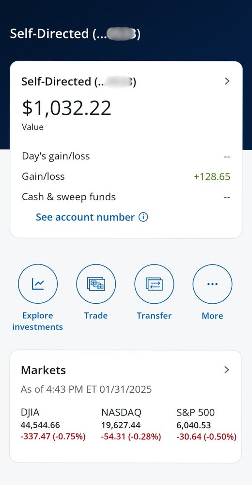
Before
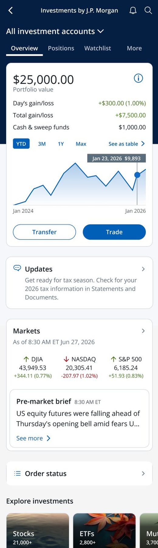
After
Outcomes
Measured over 90 days post-launch against the pre-launch baseline:
What I learned
Three things stuck with me from this work:
Phasing labels separately from layout was the right call. It let us isolate which change drove which lift, instead of shipping a wholesale rebuild and guessing.
The hardest labels weren’t the technical ones. They were the ones where users, legal, and brand had different mental models for the same word. The craft was finding the version where all three could live.
Visual hierarchy and findability mattered as much as the labels themselves. Competitive patterns showed us where the category had landed; heatmaps and tap data showed us where users actually got stuck; customer interviews told us why. We didn’t ship a change unless those three pointed the same direction.
Let’s work together. See my resume.